
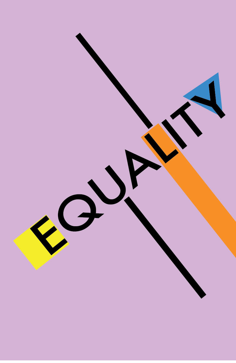
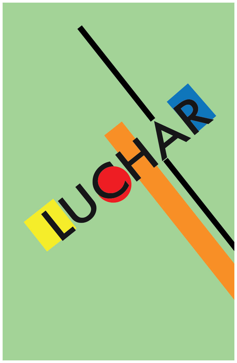
DACA Posters
DACA is important to me because i know many people living under this immigration policy. I took this topic as my focus for this poster project.
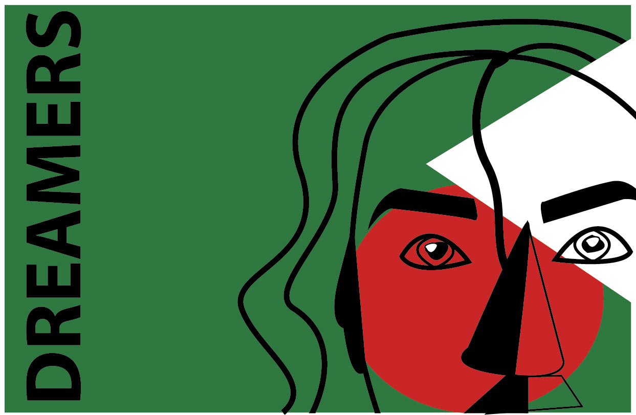
I wanted to express words of strength associated with who these Dreamers are through type and illustration. I wanted subtle background colors to emphasize the impact of the words themselves which were illustrated with bold shapes and pops of bright color. The inspiration behind the word choices come from the protests that have occurred globally.
How-To Poster
A how-to poster features a list of steps to complete a task or action. I directed my audience through a facial treatment.
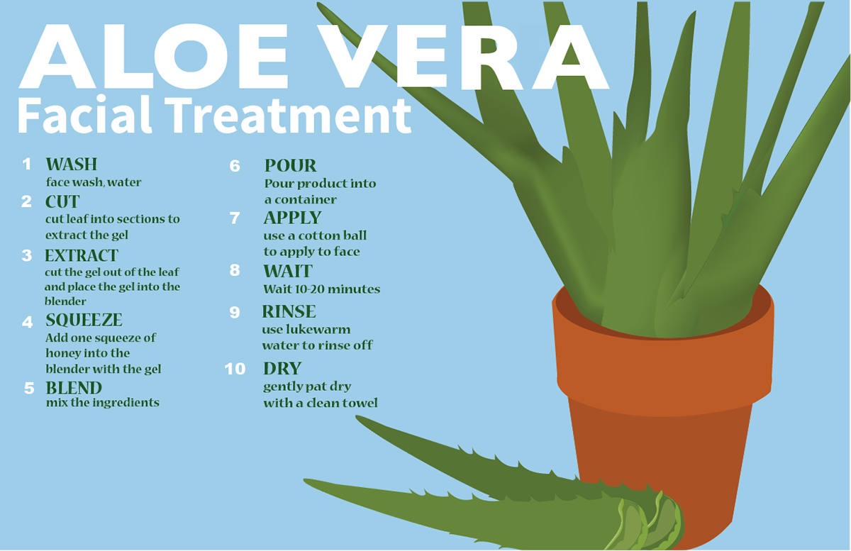
The colors I chose for this project created a calm and relaxed aesthetic. I chose the aloe vera plant as the main illustration because it is the main ingredient needed for the recipe. I also explored how type and the illustration could work together in my poster.
Mash-up Poster
This project involved remixing two different vinyl albums. I dissected both albums and chose key characteristics that stood out to me.
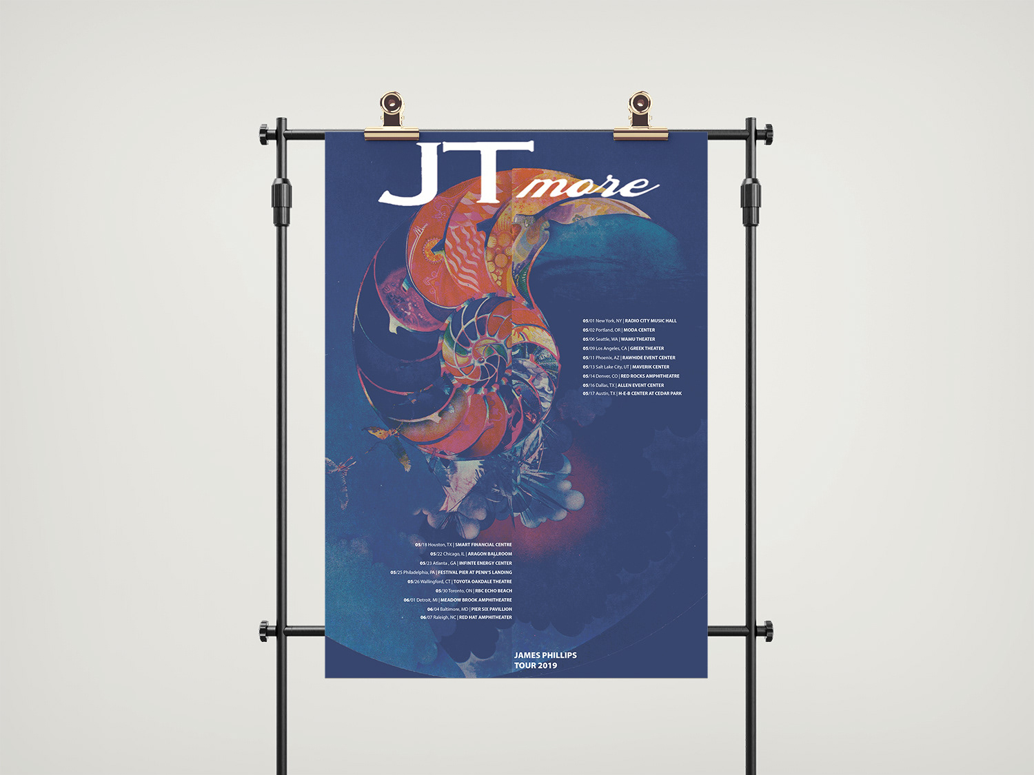
The idea behind the poster was to emphasize the color of the album and draw one's attention. I explored different fonts, weights and sizes. I chose a text size that was minimal and made the audience want to read the poster.
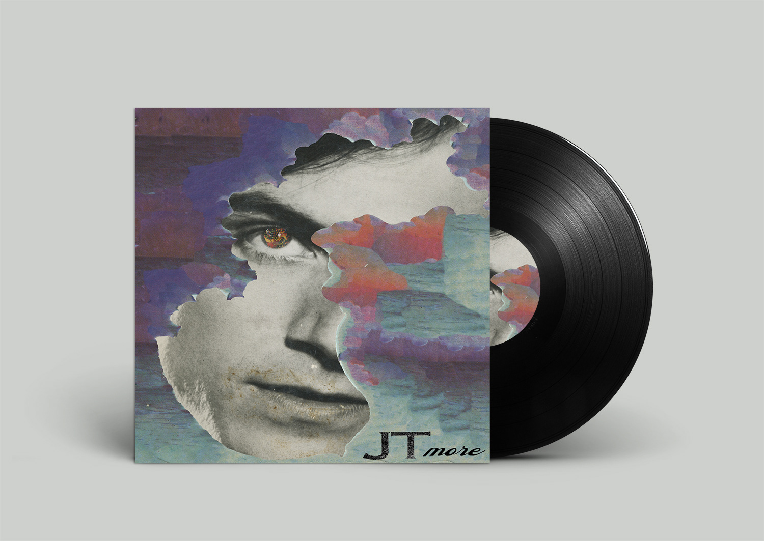
The main focus of this project was to develop an album name and visually merge two contrasting albums into a single cohesive design. One album featured vibrant color, while the other was entirely black and white. I’m drawn to bold, bright colors that highlight key elements, which inspired the die-cut overlay above the black-and-white face. This use of color draws attention to carefully chosen features, bringing the album cover to life. The vinyl record mirrors this design, maintaining a cohesive visual identity throughout the project.